Body Care
Artful Tiles from an English Textile Designer
Jun
Some tiles quietly do their job. They cover a wall, protect a backsplash, survive a splash of olive oil, and ask for very little applause. Then there are artful tilesthe kind that make a room stand up straighter, clear its throat, and say, “Yes, actually, I do have a personality.” When those tiles come from an English textile designer, the story becomes even better, because pattern is no longer just decoration. It becomes rhythm, history, craft, and a very elegant excuse to stare at your kitchen wall while pretending to make tea.
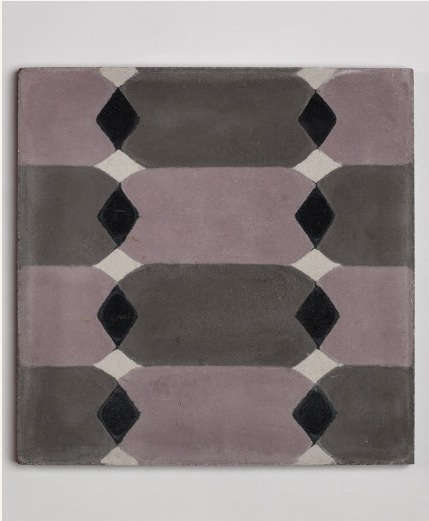
The phrase “artful tiles from an English textile designer” naturally points to the world of Neisha Crosland, a British textile and surface pattern designer known for bold yet balanced motifs, geometric repeats, floral references, wallpapers, fabrics, rugs, vinyl flooring, and decorative tiles. Her work shows how a designer trained in textiles can bring softness, movement, and visual intelligence to hard surfaces. A tile may be ceramic, cement, or vinyl, but in Crosland’s hands it behaves almost like fabric: repeating, shifting, catching the eye, and creating atmosphere.
This is why her tile designs feel different from ordinary patterned tile. They are not loud simply for the sake of being loud. They do not shout across the room like a guest who has discovered espresso for the first time. Instead, they use symmetry, scale, color, and spacing to create a composed visual language. The result is tile that works in kitchens, bathrooms, hallways, mudrooms, and powder rooms without looking like it wandered in from a trend report and forgot to leave.
Who Is the English Textile Designer Behind the Look?
Neisha Crosland is a London-based British textile and surface pattern designer whose career has moved across fabric, wallpaper, flooring, rugs, book covers, stationery, and tiles. Her background in textile design is central to understanding why her tile collections feel so alive. Textile designers think in repeat patterns. They understand how a motif behaves when multiplied, mirrored, rotated, enlarged, or interrupted. That skill translates beautifully to tile because tile itself is a modular object. One square is nice. Twenty squares become a visual conversation.
Crosland studied at Camberwell College of Arts and the Royal College of Art, and her designs have been associated with refined interiors, heritage craft, and contemporary pattern. Her work has appeared across luxury homes and design-led spaces, but it avoids the coldness that sometimes haunts “serious” design. There is wit in it. There is motion. There is a sense that a geometric pattern can be disciplined without being boringrather like a well-trained dog wearing a silk scarf.
Her tile-related work includes handmade matte glazed tiles, cement-inspired designs, and luxury vinyl tile collaborations. Some designs draw from Florentine, Haveli, lattice, boomerang, domino, and parquet-like ideas, translating global and historical references into surfaces that feel fresh rather than museum-stiff. This matters because today’s homeowners are looking for interiors with soul. They want rooms that feel collected, layered, and personalnot like they were assembled during a ten-minute panic scroll through a generic showroom catalog.
Why Textile Designers Make Fascinating Tile Designers
Tile and textile may seem like opposites. Fabric bends, folds, drapes, and flutters. Tile is firm, durable, and not particularly interested in fluttering unless your contractor has done something deeply alarming. But both materials share a design foundation: pattern. A textile designer understands repeat, border, scale, contrast, and visual flow. These are exactly the tools needed to turn a tiled surface from plain background into architectural character.
In a fabric, a motif must work across cushions, curtains, upholstery, or wallpaper. In tile, that motif must work across walls and floors while also obeying grout lines, room proportions, corners, edges, and practical installation constraints. A strong tile pattern must survive repetition without becoming dizzying. It must be interesting up close and harmonious from across the room. That is harder than it looks. Anyone who has chosen a sample tile under perfect showroom lighting and later discovered it behaves like a marching band in the bathroom understands the danger.
Crosland’s approach is compelling because it treats tile as surface pattern rather than surface filler. Her designs often use geometric structure softened by color and proportion. A lattice may feel architectural, but the color keeps it human. A boomerang motif may suggest movement, but the repeat makes it orderly. A diamond or check pattern may reference historic floors, yet the palette can make it modern. This balance is what gives artful tiles their staying power.
The Appeal of Handmade and Patterned Tiles
Patterned tiles have enjoyed a major return in interior design because they offer instant character. Subway tile is classic, useful, and dependable, but after years of seeing it everywhere, many homeowners now want surfaces with more personality. Decorative tile can create a focal point behind a range, frame a bathroom vanity, energize a laundry room, or turn an entry floor into a proper hello.
Handmade tiles add another layer of charm. Slight variations in glaze, edge, and tone create a surface that feels alive. These imperfections are not flaws; they are the fingerprints of craft. In the right room, handmade matte glazed tiles can soften modern cabinetry, warm up stone counters, and prevent a space from looking too polished. A little irregularity is often the difference between “designed” and “sterile.” Think of it as the interior design equivalent of leaving one curl loose on purpose.
Artful tile also works because it combines beauty with function. Kitchens and bathrooms need materials that can handle moisture, cleaning, and daily use. Ceramic and porcelain tile are popular because they are durable and easy to maintain when properly installed. Vinyl tile, especially luxury vinyl tile, brings a different benefit: warmth underfoot, water resistance, and easier installation in some settings. The best choice depends on where the tile will go, how much traffic it will receive, and how much maintenance the homeowner is willing to tolerate after the novelty wears off.
Signature Elements of Crosland-Inspired Tile Design
1. Geometric Motifs with Soft Edges
One of the strongest features in this design world is geometry that feels elegant rather than mechanical. Diamonds, lattices, checks, and repeating arcs can structure a room without making it feel rigid. This is especially useful in transitional interiors, where homeowners want both classic references and modern clarity.
2. Pattern That Moves
Textile designers are trained to create movement across a surface. In tile, movement can come from diagonal lines, mirrored motifs, alternating colors, or repeated shapes that guide the eye. This is why a patterned hallway floor can feel longer, a backsplash can feel more layered, and a powder room can suddenly become the most interesting room in the house. Small rooms love drama. They are tiny stages with plumbing.
3. Color Palettes That Age Gracefully
Artful tiles do not have to rely on neon color or extreme contrast. Many of the most timeless designs use soft blues, creams, grays, violets, blacks, warm neutrals, or chalky tones. These shades allow pattern to shine without overpowering the rest of the room. A restrained palette also makes decorative tile easier to live with for years.
4. Historic References Without Costume Drama
Great tile design often borrows from old floors, Islamic geometry, European decorative arts, Indian architecture, Italian motifs, or Arts and Crafts traditions. The trick is translation. A designer must pull the spirit of the reference into the present without making the room look like a theme restaurant. Crosland’s work succeeds because it suggests history rather than copying it too literally.
Where to Use Artful Tiles at Home
The safest place to start is a backsplash. A kitchen backsplash gives patterned tile enough visibility to matter but not so much square footage that it overwhelms the room. Behind a range, decorative tile can act like framed artwork. Paired with simple cabinetry, unlacquered brass, marble, soapstone, butcher block, or painted wood, patterned tile becomes a rich focal point.
Bathrooms are another natural home for artful tiles. A powder room can handle a bold floor or full tiled wall because the space is small and visitors do not live there long enough to stage a design intervention. In a primary bathroom, patterned tile works beautifully on the floor, in a shower niche, behind a vanity, or as a border paired with plain field tile. The goal is balance. Let one surface be the star and allow the rest of the room to support it.
Entryways, mudrooms, and laundry rooms are also excellent candidates. These spaces are hardworking and often neglected, which makes them perfect for pattern. A geometric tile floor in an entry sets the tone for the house. A laundry room with decorative tile can make folding towels feel slightly less tragic. That is not a miracle, but it is progress.
How to Choose the Right Pattern
Start with scale. Large rooms can usually handle larger motifs, while smaller rooms often benefit from tighter repeats or patterns used in limited areas. However, do not assume small rooms require tiny patterns. A bold design in a small powder room can feel intentional and chic. The key is confidence. Pattern can smell fear.
Next, consider contrast. High-contrast black-and-white tiles create drama and structure. Softer tone-on-tone designs feel calmer and easier to layer with other materials. If your cabinets, counters, wallpaper, and lighting are already expressive, choose a quieter tile. If the room is mostly plain, tile can carry more visual weight.
Then look at the repeat. Some patterns create a strong directional effect. A diagonal or diamond layout may lead the eye across the floor. A lattice may form a network that feels formal. A boomerang or curved motif may add playful energy. Before ordering, lay out samples and photograph them from different distances. A tile that looks charming in one hand can become very enthusiastic when multiplied by 400.
Material Matters: Ceramic, Cement, Porcelain, and Vinyl
Ceramic tile is a classic choice for walls, backsplashes, and many bathroom applications. It offers color, glaze variety, and a crafted look. Porcelain is denser and often more water resistant, making it suitable for floors, wet areas, and high-traffic rooms. Cement tile can be gorgeous, especially for matte patterned surfaces, but it is porous and usually requires sealing and more careful maintenance. It is the glamorous friend who looks amazing at dinner but needs three taxis, two chargers, and emotional support by midnight.
Luxury vinyl tile offers another route, especially for homeowners who want pattern, comfort, and practical installation. Crosland’s vinyl flooring collaborations show how a textile designer’s eye can elevate a material sometimes dismissed as purely utilitarian. When designed well, vinyl tile can reference parquet, checkered floors, or historical motifs while offering warmth underfoot and easier cleaning.
The right material depends on the room. For a kitchen backsplash, glazed ceramic or porcelain is often practical. For a bathroom floor, slip resistance and water performance matter. For an entryway, durability and cleanability should guide the decision. For a decorative wall, you may have more freedom to choose texture and finish. Beauty is important, but so is living with the surface after the honeymoon phase.
Design Pairings That Make Patterned Tile Shine
Artful tiles are easiest to use when paired with materials that understand the assignment. Natural wood softens geometric tile. Marble or limestone adds quiet luxury. Painted cabinetry in cream, deep green, slate blue, or warm gray can support decorative tile without competing. Brass, bronze, and nickel hardware add subtle sparkle. Woven shades, linen curtains, and textured rugs connect the hard tile surface back to textile warmth.
For a modern English-inspired look, combine patterned tile with shaker cabinets, aged brass, stone counters, open shelving, and a few imperfect handmade objects. For a more contemporary look, pair geometric tile with slab-front cabinets, simple lighting, and restrained colors. For a bohemian or collected look, layer patterned tile with vintage furniture, botanical prints, woven baskets, and ceramics.
The biggest mistake is letting every element compete for attention. A patterned tile wall, floral wallpaper, striped curtains, terrazzo counter, and sculptural lighting can work in expert hands, but for most rooms it becomes visual karaoke. Choose a lead singer. Let the backup vocals harmonize.
Why Artful Tiles Feel So Personal
Tiles are permanent enough to feel like a commitment, which is partly why they carry emotional weight. Paint can be changed in a weekend. Pillows can be swapped after one too many online shopping evenings. Tile asks for planning, budget, installation, and a certain willingness to say, “Yes, this pattern is me.” That is why choosing artful tiles can feel more personal than choosing a neutral surface.
When a textile designer creates tile, the result often has a human quality. The pattern suggests hand, memory, travel, craft, and observation. It might echo a scarf, a wallpaper repeat, a historical floor, a garden path, or a fragment of architecture. This makes the surface feel less like a building product and more like a design story.
That story is especially appealing now because many homeowners are moving away from interiors that look overly staged. People want homes with character, texture, color, and evidence of taste. Artful tiles answer that desire. They bring pattern into practical spaces and remind us that utility does not have to be plain. A sink can be surrounded by poetry. A hallway can have rhythm. A laundry room can have flair, even if the socks remain mysteriously single.
Practical Tips Before Installing Decorative Tile
Always order samples before committing. View them in natural light, evening light, and the weird in-between light that makes everyone question their life choices. Place samples next to cabinets, counters, flooring, and wall paint. If using patterned tile on a floor, lay several pieces together so you can see the repeat.
Discuss grout early. Grout color can change the entire effect. Matching grout softens the pattern and makes the installation feel seamless. Contrasting grout emphasizes each tile and can make the grid more visible. Neither is wrong, but the choice should be intentional.
Hire an experienced installer for complex patterns, handmade tiles, cement tiles, or layouts requiring precision. Patterned tile depends on alignment. A small error can become obvious once the design repeats. Also, confirm maintenance requirements before purchase. Some materials need sealing, gentle cleaners, or special care. Falling in love with a tile is wonderful; discovering it cannot tolerate your spaghetti sauce lifestyle is less wonderful.
Experience Notes: Living with Artful Tiles from an English Textile Designer
There is a particular joy in living with tile that was clearly designed by someone who understands pattern. The experience is different from living with a plain surface. You notice it in small moments: walking barefoot into the kitchen in the morning, seeing a lattice pattern catch the low light, or watching a bathroom floor turn from background into quiet artwork. Good patterned tile does not demand constant attention, but it rewards attention when you give it.
In real homes, artful tiles often become the detail people remember. Guests may forget the exact paint color or cabinet brand, but they remember the entry floor with the soft geometric repeat. They remember the powder room where the tile makes the sink wall feel like a tiny gallery. They remember the kitchen backsplash that looks handmade, slightly romantic, and just unusual enough to start a conversation. This is the power of surface design: it gives memory a place to land.
One of the best experiences with textile-inspired tile is how it changes with surrounding materials. Pair the same patterned tile with white walls and it feels crisp. Place it beside oak cabinetry and it becomes warm. Add aged brass and it leans traditional. Combine it with matte black fixtures and it becomes sharper and more graphic. A good pattern is flexible. It can speak several design languages without losing its accent.
There is also a practical emotional benefit. Pattern is forgiving. A lightly patterned floor can hide dust, small marks, and everyday life better than a perfectly plain pale surface. This does not mean decorative tile is magic. You still have to clean it. Sadly, no tile has yet agreed to mop itself. But pattern can make a lived-in room feel charming rather than messy, especially in busy areas such as entryways, kitchens, and laundry rooms.
Another real-world lesson is restraint. It is tempting to fall in love with an artful tile and cover every available surface. The sample arrives, the heart races, and suddenly the homeowner is considering tiling the dog’s water bowl area in a Florentine-inspired repeat. Breathe. The most successful rooms usually give patterned tile a defined role. Use it as a backsplash, a floor, a shower wall, a fireplace surround, or a framed feature. Let it be special.
Finally, artful tiles age best when they reflect the homeowner’s taste rather than a passing trend. A design inspired by an English textile designer carries depth because it comes from a broader tradition of drawing, printmaking, repeat pattern, and interiors. It is not merely a fashionable surface. It is a crafted idea made durable. That is why these tiles feel so satisfying: they bring together the beauty of fabric, the strength of architecture, and the pleasure of pattern in one hardworking material.
Conclusion
Artful tiles from an English textile designer prove that the best interiors are not built from function alone. They are shaped by pattern, memory, craft, and a little courage. Neisha Crosland’s tile and surface-pattern work shows how textile thinking can transform hard materials into expressive architectural details. Whether used in a kitchen backsplash, bathroom floor, entryway, or laundry room, these designs offer a way to make everyday spaces feel more personal and more alive.
The secret is balance. Choose a pattern with rhythm, a palette you can live with, and a material suited to the room. Pair decorative tile with quieter finishes, respect the power of grout, and do not skip samples. When done well, artful tile becomes more than decoration. It becomes the part of the home that smiles back.
Note: This HTML body is written for web publishing, with SEO metadata placed at the end in JSON format as requested.
