
Skincare
How To Pick The Best Curtain Color
Aug
Choosing curtain color sounds easy until you are standing in front of 47 “almost white” fabric samples, wondering why one looks like whipped cream and another looks like a dentist’s waiting room. Curtains are not just soft rectangles that prevent your neighbors from learning your snack schedule. They influence how large a room feels, how much light it gets, whether the space feels calm or dramatic, and whether your furniture finally looks intentional instead of randomly assembled during a weekend sale.
The best curtain color depends on more than your wall paint. You also need to consider your lighting, flooring, furniture, rug, room size, desired mood, privacy needs, and whether you want the curtains to quietly blend in or stroll into the room wearing a tiny spotlight. This guide will help you choose a curtain color that looks polished, feels personal, and still makes sense six months after the excitement of redecorating wears off.
Note: Fabric colors can look dramatically different in daylight, evening light, and under different bulbs. Always test samples in your actual room before committing to several yards of fabric and an emotional support steamer.
Start With the Role You Want Your Curtains to Play
Before choosing a shade, decide what job your curtains need to do visually. Are they meant to disappear into the room, support the existing color palette, or become a noticeable design feature? There is no universally correct answer. The right choice depends on the look you want when you walk through the door.
Choose Blending Curtains for a Calm, Cohesive Look
Blending curtains are close to your wall color, usually one or two shades lighter or darker. This approach creates a smooth, understated look that works especially well in small rooms, modern spaces, rental apartments, and homes with lots of visual activity already happening in the furniture or artwork.
For example, if your walls are soft greige, curtains in warm ivory, oatmeal, mushroom, or a slightly deeper taupe can create a layered neutral palette. The room feels collected without looking like every item was purchased from the same showroom display.
Matching curtains to the walls can also make ceilings appear taller, especially when the curtain rod is mounted high above the window frame. The eye travels upward in one uninterrupted vertical line, which is a polite little optical illusion for rooms that need a confidence boost.
Choose Contrast Curtains for Drama and Personality
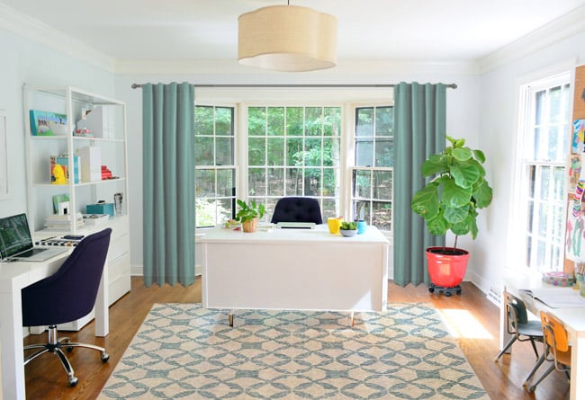
Contrasting curtains create a stronger focal point. They are useful when your walls are neutral and the room needs more energy, depth, or color. Navy curtains against warm white walls, olive green curtains against beige walls, or rust-colored curtains against soft gray walls can instantly make a room feel more styled.
The trick is to repeat the curtain color somewhere else in the room. A navy curtain can connect to a navy pillow, a blue rug detail, a framed print, or even a ceramic lamp base. You do not need to match every object perfectly. In fact, please do not. A room where every blue is identical tends to look like it was assembled by a very enthusiastic paint chip.
Look Beyond the Wall Color
Your wall color matters, but it should not be the only thing steering the curtain decision. The best curtain color usually relates to the largest visual elements in the room: flooring, upholstery, rugs, cabinets, bedding, or artwork.
Use the Largest Pattern as Your Color Road Map
If your rug, sofa, wallpaper, or bedding has a noticeable pattern, pull a secondary color from it for the curtains. A cream-and-blue floral rug might inspire dusty blue curtains. A patterned comforter with muted green leaves may look beautiful with solid sage drapes. This creates a coordinated effect without making the room look overly matched.
When your room already has a bold patterned rug or a colorful sofa, solid curtains are often the safer choice. They give the eye a place to rest. Think of them as the reliable friend at a loud dinner party: not trying to steal the conversation, but making everything work better.
Pay Attention to Flooring and Wood Tones
Wood floors and furniture have undertones, too. Honey oak, walnut, cherry, black-stained wood, and weathered gray finishes all influence how curtain colors read. Warm wood often pairs naturally with cream, camel, olive, terracotta, rust, deep blue, and warm gray. Cooler gray flooring can work beautifully with charcoal, soft white, muted blue, slate, dusty pink, or blue-green.
Do not assume that gray curtains match every gray floor. Gray can lean blue, purple, green, beige, or brown. A cool blue-gray curtain next to a warm taupe sofa can look slightly confused, like it arrived dressed for a different event.
Understand Undertones Before You Buy
Undertones are the subtle warm or cool colors hidden beneath a main shade. They are why two white curtains can look completely different next to the same wall. One white may have yellow undertones and feel creamy. Another may have blue undertones and look crisp or icy.
Warm colors generally include reds, oranges, yellows, warm browns, and warm beige tones. They make a room feel cozy, sunny, and welcoming. Cool colors include blues, greens, purples, cool grays, and blue-based whites. They often feel calmer, fresher, and more spacious.
Match Temperature for an Easy Win
For the simplest approach, pair warm walls with warm curtains and cool walls with cool curtains. Beige walls with ivory, camel, olive, rust, or warm brown curtains tend to feel harmonious. Blue-gray walls with soft white, charcoal, slate, navy, or cool green curtains often feel balanced.
This does not mean every color must be from the same family. You can mix temperatures intentionally. A warm cream curtain against a soft sage wall can feel charming and natural. The goal is to make the contrast look deliberate rather than accidental.
Use Complementary Colors Carefully
Colors opposite each other on the color wheel create contrast. Blue and orange, yellow and purple, and red and green are classic complementary combinations. In home decor, the easiest way to use these pairings is with softened versions rather than full-strength crayon-box shades.
For instance, muted terracotta curtains can look sophisticated with dusty blue walls. Soft lavender curtains can add elegance to a pale yellow room. Olive curtains can warm up a blush or clay-colored space. The key is balance: let one color lead, and let the other support.
Consider Natural Light and Artificial Lighting
Lighting can make a curtain color look richer, duller, warmer, cooler, or completely unrelated to the online photo that convinced you to order it at 1:14 a.m. A fabric that appears pale gray in a product listing may look lavender in your north-facing bedroom or beige under warm lamps.
North-, South-, East-, and West-Facing Rooms
North-facing rooms usually receive cooler, softer daylight. Warm curtain colors such as ivory, beige, caramel, dusty rose, warm green, and muted gold can help counteract the bluish cast. South-facing rooms receive stronger, warmer light and can usually handle cooler shades like blue, gray, sage, and crisp white.
East-facing rooms are brighter in the morning, while west-facing rooms receive more intense afternoon light. In sunny rooms, pale curtains may wash out, while very dark curtains can feel visually heavy. Mid-tone fabrics, textured neutrals, or lined curtains often provide the best middle ground.
Check Your Evening Lighting
Do not test curtain swatches only at noon. Hold them near the window in the morning, afternoon, and evening. Then turn on your usual lamps. Warm bulbs can make cream, beige, rust, and red tones glow while muting cooler shades. Cooler lighting can sharpen blues and greens but may make warm beige look grayish.
Take photos of the swatches during each test. Your eyes adjust quickly, but a few side-by-side photos can reveal which fabric works consistently throughout the day.
Choose Curtain Colors by Room
Living Room Curtain Colors
Living room curtains should support the room’s overall personality. Neutral curtains in ivory, beige, oatmeal, soft gray, or flax linen work well in flexible spaces where furniture and accessories may change over time. For a bolder living room, try deep navy, olive, chocolate brown, burgundy, rust, or patterned curtains that repeat colors from your rug or artwork.
If your living room has a beautiful view, use curtains that frame it rather than compete with it. Soft white, light linen, pale gray, or semi-sheer neutral panels can add softness without blocking the star of the show.
Bedroom Curtain Colors
Bedrooms benefit from colors that support rest and privacy. Blue, sage green, dusty lavender, warm taupe, soft charcoal, cream, and muted pink are all popular choices because they can feel soothing without being boring. If you need darkness for sleep, use blackout lining behind whatever color you love. Your blackout curtains do not need to be black unless you are decorating a bat cave with excellent taste.
For a hotel-inspired bedroom, choose curtains slightly darker than the walls and extend them close to the floor. A deeper color around the windows can make the bed area feel more cocoon-like and intentional.
Dining Room Curtain Colors
Dining rooms can handle more drama because people spend less continuous time there than in a living room or bedroom. Rich green, navy, wine, cinnamon, patterned florals, or striped drapes can create a memorable atmosphere. If the room has formal furniture or a statement chandelier, curtains with a little texture or subtle sheen can add depth.
Kitchen and Bathroom Curtain Colors
Kitchens and bathrooms usually need lighter, easier-care window treatments. White, cream, soft gray, pale blue, sage, gingham, small florals, or simple stripes work well. In humid areas, choose fabrics and linings that are washable or designed to handle moisture. A dramatic velvet curtain may look glamorous for approximately six minutes in a bathroom before practicality enters the chat.
Solid Curtains vs. Patterned Curtains
Solid curtains are versatile, calming, and easier to coordinate. They work especially well when your room already contains patterned rugs, upholstered furniture, wallpaper, or busy art. Textured solids, such as linen, woven cotton, velvet, or subtle slub fabric, can add interest without adding another obvious pattern.
Patterned curtains are ideal when a room feels flat or overly neutral. Stripes can add height or width depending on their direction. Florals can soften a traditional or cottage-style room. Geometric prints can bring energy to modern spaces. Botanical patterns can work beautifully with natural wood and green accents.
Use patterned curtains when at least one color in the pattern connects to the room. A curtain pattern should feel like part of the conversation, not a stranger shouting from across the room.
Do Not Forget Fabric, Opacity, and Function
Color is important, but fabric changes how that color behaves. A pale linen curtain may look airy and relaxed, while the same color in velvet can feel rich and formal. Cotton and linen tend to suit casual, coastal, farmhouse, contemporary, and transitional rooms. Velvet adds depth and drama. Sheers soften daylight and offer limited privacy. Blackout-lined curtains are useful for bedrooms, media rooms, nurseries, and windows that receive harsh morning sun.
Sheer white curtains can make a dark room feel lighter, but they may not provide enough privacy at night. Dark curtains can add sophistication, but in a small, dim room they may visually shrink the space. Consider layering: a sheer panel for daytime softness and a heavier drape for privacy, temperature control, and late-morning sleeping ambitions.
Common Curtain Color Mistakes to Avoid
The first mistake is buying curtains before choosing paint, rugs, or major furniture. Curtains are easier to coordinate after the large, expensive decisions are made. The second mistake is choosing a color from a phone screen without testing a swatch. Screens are useful, but they also believe every beige is somehow “perfectly neutral.”
Another common issue is choosing curtains that are too bright, too shiny, or too close to a wall color without matching the undertone. Stark white curtains against warm cream walls can feel harsh. Cool gray curtains beside warm beige upholstery can look disconnected. Short curtains can also make a room feel unfinished, regardless of their color.
Finally, avoid selecting curtains in isolation. Bring home samples and compare them with the wall, sofa, rug, flooring, and hardware. The best choice is rarely the fabric that looks best alone. It is the fabric that makes everything else look better.
A Simple Seven-Step Curtain Color Formula
- Choose your wall color, flooring, major furniture, and rug first.
- Decide whether your curtains should blend in or stand out.
- Identify whether your room is warm-toned, cool-toned, or mixed.
- Pull one or two possible curtain colors from your rug, artwork, bedding, or upholstery.
- Order or borrow fabric swatches instead of trusting digital photos.
- View samples in morning, afternoon, and evening light.
- Choose the option that supports the room’s mood, function, and long-term style.
When in doubt, a textured neutral curtain is a reliable starting point. It works with many styles, makes a room feel finished, and gives you plenty of freedom to change pillows, rugs, and accessories later. But if a bold color makes you smile every time you see it, that is valuable information, too. Your home should not feel like a showroom where nobody is allowed to eat crackers.
Experiences and Lessons From Choosing Curtain Colors
People often assume that curtain color is a minor finishing detail, but it can change a room more than expected. One of the most common experiences happens in a newly painted room. Someone chooses a beautiful warm beige paint, buys “white” curtains online, hangs them up, and suddenly the curtains look aggressively blue. Nothing is technically wrong with either choice. The issue is that the wall paint has warm yellow undertones while the curtain fabric has a cool blue-white base. Together, they make each other look louder.
A better approach is to place multiple fabric samples directly against the wall. In many homes, the winning option is not pure white at all. It may be ivory, oyster, natural linen, almond, or a soft cream that looks almost white from across the room but feels much warmer and more connected up close.
Another frequent experience involves gray rooms. Gray is often treated as a simple neutral, but it has a surprisingly dramatic personality. A gray sofa may lean blue, while gray walls lean beige, and a gray curtain may lean purple. Put all three together and the room can look like it is having a quiet disagreement. The easiest fix is to stop chasing identical gray and introduce a bridging neutral. Warm white, oatmeal, flax, taupe, or soft charcoal curtains can unify mixed grays more effectively than another “gray” fabric.
Small spaces also teach useful lessons. In compact bedrooms or apartments, dark curtains can look amazing in a photo but may feel heavy once they cover a large part of the wall. That does not mean dark curtains are forbidden. It simply means they work best when balanced with lighter bedding, reflective lighting, pale walls, or a large window. A deep navy curtain in a tiny room can feel elegant if the rest of the space has breathing room. It can feel gloomy if the room is already packed with dark furniture, dark rugs, and a laundry chair that has become a permanent resident.
Patterned curtains create another real-life learning curve. A pattern that looks charming on a small swatch can become very loud when multiplied across two floor-length panels. Before buying, imagine the pattern at full scale. Large floral or geometric designs often work best when the room has simple furniture and solid upholstery. Small-scale patterns can read as texture from a distance and are often easier to live with in bedrooms, kitchens, and casual dining spaces.
Lighting is perhaps the biggest surprise. A pale sage curtain can look gray in the morning, green in the afternoon, and almost beige under warm lamps at night. This is not necessarily a bad thing. Color variation can make a room feel layered and alive. The important question is whether you like the fabric in every version of its personality. If a curtain looks lovely only between 11:00 a.m. and 12:30 p.m., it may be too high-maintenance for a window treatment.
Many homeowners also discover that function affects color satisfaction. A sheer cream curtain may look dreamy in a sunny bedroom, but if it does not block enough streetlight or early sunrise, the dreamy effect may disappear at 5:42 a.m. Layering sheers with blackout-lined drapes lets you keep the soft color you love while giving the room better privacy and sleep control. In living rooms, a light-filtering panel may be all you need. In bedrooms, function deserves a seat at the design table.
The most successful curtain choices usually come from slowing down. Instead of buying the first fabric that looks nice online, gather samples, live with them for a few days, and see how they behave with your furniture, paint, and light. The perfect curtain color is rarely the one that looks most impressive in isolation. It is the one that makes the entire room feel easier, warmer, more balanced, and more like home.
Conclusion
The best curtain color is not determined by a single decorating rule. It comes from understanding your room’s light, undertones, furnishings, function, and mood. Choose curtains close to the wall color for a calm, spacious look. Choose contrast for personality and drama. Use patterns when the room needs energy, and use textured solids when the space already has plenty happening.
Most importantly, test fabric swatches in your own space before you buy. A thoughtful curtain color can make a room look larger, cozier, brighter, calmer, or more polished. It is one of the easiest ways to make a home feel complete without replacing every piece of furniture you have ever owned.
SEO Tags

