Beauty Unlocked
An Orange, Brown, and Tan Dining Room Mood Board
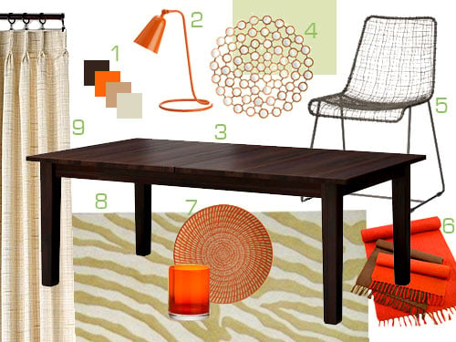
Jun
An orange, brown, and tan dining room mood board sounds simple at first, like someone invited a pumpkin, a latte, and a leather chair to dinner. But when the palette is handled well, it becomes one of the most welcoming, layered, and quietly stylish color stories you can bring into a dining space. It is warm without shouting, earthy without feeling dull, and bold enough to make guests say, “Wait, why does this room feel so good?” before they even notice the mashed potatoes.
This palette works because it borrows from nature: clay, wood, sand, caramel, cinnamon, tobacco, terracotta, toasted bread, and late-afternoon sunlight. In a dining room, those tones make perfect sense. Dining rooms are gathering spaces. They need comfort, appetite, conversation, and a little drama. Nobody wants a room that feels like a dentist’s waiting area with a table in the middle.
A mood board helps organize that feeling before you buy paint, chairs, rugs, or a chandelier that looked “perfect online” but arrives with the personality of a spaceship. With a strong orange, brown, and tan dining room mood board, you can see how color, texture, lighting, furniture, and accessories will work together before your credit card starts sweating.
Why Orange, Brown, and Tan Work So Well Together
Orange, brown, and tan belong to the same warm, earthy family. That shared warmth makes the colors feel connected instead of random. Orange brings energy and personality. Brown adds depth, grounding, and sophistication. Tan softens everything, acting like the calm friend who prevents the group chat from becoming chaos.
For a dining room, this trio is especially effective because it creates a cozy atmosphere without relying only on dark colors. Tan keeps the palette breathable. Brown makes the space feel anchored. Orange adds movement, especially when used in shades like burnt orange, rust, amber, clay, copper, or terracotta. The trick is to avoid overly bright orange unless you want your dining room to feel like it is sponsored by traffic cones.
The Mood: Warm, Relaxed, and Grown-Up
The best orange, brown, and tan dining room mood board should feel collected rather than decorated in one afternoon. Think of a room with a walnut dining table, tan linen curtains, caramel leather chairs, a rust-colored vintage-style rug, soft brass lighting, and handmade ceramic dishes. Nothing screams for attention, but everything quietly agrees to look fantastic together.
This palette can lean rustic, modern, midcentury, bohemian, traditional, Mediterranean, or contemporary depending on the materials you choose. A dark brown pedestal table with sculptural chairs feels modern. A farmhouse table with woven seats feels casual and organic. A glossy brown sideboard with terracotta walls feels dramatic and editorial. Same family, different outfits.
Start with the Foundation: Walls, Floors, and Large Furniture
Every dining room mood board needs a foundation. These are the biggest visual surfaces: walls, floors, table, chairs, rug, and storage. If those pieces fight each other, no amount of cute napkin rings can save the room. Napkin rings are helpful, but they are not licensed therapists.
Wall Colors That Set the Tone
For walls, tan is the safest and most flexible choice. A warm beige, camel, sand, mushroom, or soft taupe creates a neutral backdrop that still feels cozy. This is a great option if your dining room is small, open to other rooms, or already has strong wood furniture.
If you want a more dramatic dining room, consider a clay, terracotta, or muted burnt orange wall color. These shades look beautiful with dark wood, brass fixtures, cream trim, and linen textiles. The key is choosing a muted orange with brown, red, or peach undertones instead of a loud citrus shade. Muted orange says “curated dinner party.” Neon orange says “sports drink emergency.”
Brown walls can also be stunning, especially in a formal dining room. Chocolate, espresso, coffee, or walnut tones can make the room feel intimate and elegant. To keep brown walls from feeling heavy, pair them with tan upholstery, ivory artwork mats, warm lighting, glassware, and natural textures like cane, rattan, linen, or stone.
Dining Tables: The Anchor Piece
The dining table is the main character. In this palette, wood is usually the best choice because it naturally brings brown into the room. Walnut, oak, mango wood, acacia, and reclaimed wood all work, but each creates a different mood.
Walnut feels rich and polished. Oak feels casual and timeless. Reclaimed wood feels rustic and imperfect in a charming way, like it knows good stories. A dark espresso table adds contrast against tan walls, while a medium brown table keeps the room relaxed. If your chairs are orange or caramel, choose a table with a quieter finish so the room does not become too visually heavy.
Chairs: Where Comfort Meets Color
Dining chairs are the easiest place to introduce tan, brown, or orange without committing to a full wall color. Tan upholstered chairs feel soft and elegant. Brown leather chairs add warmth and durability. Rust velvet chairs bring drama and a touch of luxury. Woven cane chairs keep the room airy and organic.
If you want a balanced mood board, try this formula: a brown wood table, tan upholstered chairs, and orange accents through the rug, art, or table linens. If you want more personality, use burnt orange chairs with a simple wood table and neutral walls. The chairs will act like punctuation marks around the table, but hopefully not exclamation points in every sentence.
How to Use the 60-30-10 Rule
The 60-30-10 rule is a classic interior design guideline that helps a room feel balanced. For an orange, brown, and tan dining room mood board, it might look like this:
- 60% tan: walls, curtains, rug background, or larger upholstery
- 30% brown: dining table, chairs, sideboard, frames, flooring, or wood trim
- 10% orange: art, pillows, florals, ceramics, lampshades, napkins, or accent chairs
This arrangement keeps orange special. If everything is orange, nothing is special. The room starts to look less like a mood board and more like a sweet potato convention. Let tan carry the space, let brown ground it, and let orange create the memorable moments.
Texture Is the Secret Ingredient
Warm palettes need texture. Without it, orange, brown, and tan can look flat. Texture gives the dining room depth and makes the mood board feel expensive, even if some items came from a budget-friendly store and one heroic coupon code.
Natural Materials to Include
Use linen curtains, woven jute rugs, cane chair backs, leather seats, wood furniture, ceramic vases, stone bowls, and matte metal finishes. These materials support the earth-tone palette and make the room feel layered. A tan linen curtain beside a walnut table is simple, but it looks intentional. A terracotta vase on a brown sideboard adds color without overwhelming the space.
Mix smooth, rough, matte, and slightly glossy finishes. For example, combine a polished wood table with a nubby woven rug, smooth ceramic dinnerware, brushed brass lighting, and soft upholstered chairs. This contrast keeps the dining room interesting even if the color palette stays restrained.
Rugs That Pull the Palette Together
A dining room rug can connect every color in the mood board. Look for rugs with rust, camel, tan, cream, chocolate, and muted orange details. Vintage-inspired patterns are especially useful because they naturally blend several warm shades.
For size, the rug should be large enough for chairs to remain on it when pulled out from the table. A tiny rug under a dining table is like a hat that only covers one eyebrow. Technically present, but not doing the job. Choose a low-pile rug for easier chair movement and cleaning, especially if your dining room regularly hosts children, pets, or adults who gesture too aggressively with pasta sauce.
Lighting Makes or Breaks the Mood
Lighting is critical in an orange, brown, and tan dining room because warm colors shift depending on the bulb temperature and time of day. Harsh overhead lighting can make the palette look muddy or overly orange. Soft layered lighting makes it glow.
Start with a statement chandelier or pendant centered over the dining table. Brass, bronze, blackened metal, woven rattan, ceramic, or milk glass fixtures all work beautifully with this palette. Add wall sconces, buffet lamps, or a small lamp on a sideboard for evening warmth. The goal is to create layers of light, not interrogate your dinner guests like they forgot to return a library book.
Warm white bulbs are usually the safest choice. They enhance tan, brown, terracotta, and wood tones. Dimmer switches are also worth considering because dining rooms often serve different moods: homework zone at 4 p.m., family dinner at 7 p.m., and “we opened the good plates” dinner party at 8 p.m.
Decor and Accessories for the Mood Board
Accessories are where the orange, brown, and tan dining room mood board becomes personal. They should support the palette, not bury the room in themed decor. A few well-chosen pieces will always look better than twelve objects all trying to be the star.
Artwork
Choose art that includes warm neutrals, abstract shapes, desert tones, botanical prints, or subtle landscape colors. A large abstract canvas with rust, cream, and espresso lines can make the dining room feel modern. Vintage botanical prints in brown frames can make it feel traditional. Photography with canyon, clay, sand, or sunset tones can reinforce the palette without looking too obvious.
Table Styling
For everyday styling, use a simple ceramic bowl, a low vase, or a wooden tray. Add dried grasses, branches, eucalyptus, or seasonal flowers in warm tones. For dinner parties, layer tan linen napkins, amber glassware, cream plates, brown chargers, and copper or brass flatware. The table should feel dressed, not trapped under a mountain of decor.
Curtains and Window Treatments
Tan or oatmeal curtains are the most versatile choice. They soften the room and allow orange and brown accents to stand out. For a richer look, try camel velvet curtains or woven Roman shades. If the room already has dark wood furniture, lighter window treatments will keep the space from feeling too heavy.
Three Complete Mood Board Ideas
1. The Modern Terracotta Dining Room
This mood board starts with soft tan walls, a dark walnut dining table, cream upholstered chairs, and a terracotta rug. Add a black and brass chandelier, abstract wall art, and matte ceramic vases. The result is modern, warm, and polished without being stiff.
2. The Casual Desert-Inspired Dining Room
Use sand-colored walls, a medium oak table, woven cane chairs, a jute rug, and burnt orange cushions. Add clay pottery, linen curtains, and framed desert photography. This version feels relaxed, sunny, and family-friendly. It is perfect for homes that want warmth without formality.
3. The Moody Chocolate and Amber Dining Room
Choose deep brown walls, tan velvet chairs, an espresso pedestal table, amber glassware, and a rust-patterned rug. Add aged brass sconces and cream artwork to brighten the palette. This is the dinner-party version of the mood board. It feels intimate, dramatic, and slightly fancy, as if the room knows how to pronounce “hors d’oeuvres.”
Common Mistakes to Avoid
The first mistake is using too much saturated orange. Orange is powerful, so it works best as an accent or in muted shades. A little burnt orange goes a long way. A lot of bright orange may make the room feel restless.
The second mistake is choosing browns with clashing undertones. Some browns are red-based, some are yellow-based, and others are cool or grayish. Place samples together before committing. A walnut table, espresso sideboard, and reddish-brown floor can work, but they need a bridge color like tan, cream, or rust.
The third mistake is forgetting contrast. If the walls, chairs, table, rug, and curtains are all medium brown or tan, the room can look like one giant bowl of oatmeal. Add contrast with cream, black, brass, dark brown, or a defined orange accent.
The fourth mistake is ignoring lighting. Warm palettes can look beautiful in natural light but dull under cool bulbs. Test paint and fabric samples in morning light, afternoon light, and evening artificial light before making final decisions.
Experience Notes: What It Feels Like to Build This Mood Board
Creating an orange, brown, and tan dining room mood board is one of those projects that feels simple until you start comparing twelve shades of tan and realize they all have secret personalities. One tan looks creamy and elegant. Another suddenly turns gray. Another looks perfect online but, in real life, has the warmth of wet cardboard. This is why the mood board process matters. It lets you test the emotional temperature of the room before you commit.
In practice, the best approach is to begin with one item you already love. It might be a walnut dining table, a rust-colored rug, a vintage landscape painting, or a set of caramel leather chairs. That piece becomes the anchor. From there, build the palette around it. If the anchor is dark brown, lighten the room with tan walls and cream textiles. If the anchor is orange, calm it down with natural wood and sandy neutrals. If the anchor is tan, add depth with chocolate brown and small hits of terracotta.
One useful experience is to create the mood board in layers. First, choose the background color: wall paint, wallpaper, or large curtains. Second, choose the grounding pieces: table, chairs, rug, and sideboard. Third, choose the accents: art, lighting, ceramics, napkins, glassware, and greenery. This order prevents the classic decorating problem where you buy adorable accessories first and then realize they match absolutely nothing except your optimism.
Another helpful lesson is that orange behaves differently depending on material. Burnt orange velvet feels rich and dramatic. Terracotta pottery feels earthy. Rust linen feels casual. Amber glass feels light and glowing. Copper metal feels polished and warm. Because of this, you can repeat orange several times in the dining room without making it feel repetitive. The color changes its attitude depending on texture.
Brown also needs variety. A dining room with only one flat brown can feel heavy, but a room with walnut, chocolate, caramel leather, woven rattan, and bronze lighting feels layered. Tan works as the breathing space between those deeper tones. It gives the eye a place to rest, which is very important in a room where people are already visually processing food, plates, flowers, candles, and someone’s dramatic retelling of a grocery store incident.
The most satisfying part of this palette is how easy it is to update seasonally. In fall, add deeper rust napkins, dried branches, and amber candles. In winter, bring in chocolate velvet, brass candlesticks, and creamy wool textures. In spring, lighten the table with tan linen, white flowers, and pale wood bowls. In summer, add woven shades, clay vases, and peach-toned flowers. The mood board stays consistent, but the room never feels stuck.
Most importantly, an orange, brown, and tan dining room should feel like a place where people want to linger. The colors should support conversation, comfort, and good food. When the palette is balanced, the room becomes warm but not loud, stylish but not precious, and cozy without feeling crowded. That is the magic of this mood board: it makes the dining room feel designed, but still human.
Conclusion
An orange, brown, and tan dining room mood board is a smart choice for anyone who wants a warm, grounded, and inviting dining space. The palette combines the energy of orange, the richness of brown, and the softness of tan to create a room that feels both stylish and comfortable. By focusing on muted orange tones, layered brown finishes, natural textures, warm lighting, and balanced contrast, you can design a dining room that feels timeless rather than trendy.
Start with a clear color ratio, choose materials that add texture, and let orange appear in thoughtful accents instead of overwhelming the room. Whether your style is modern, rustic, bohemian, traditional, or somewhere in between, this palette offers flexibility, personality, and plenty of cozy charm. Basically, it is the interior design version of a perfect dinner guest: warm, interesting, and not trying too hard.
Note: This publish-ready article synthesizes current U.S.-based interior design guidance on warm color palettes, earth tones, dining room styling, layered lighting, brown paint, terracotta accents, and neutral mood board planning.
