
Beauty Tools & Accessories
50 Completely Innocent Things That Get The Rest Of Us Thinking “They Knew What They Were Doing”
Aug
Some coincidences are believable. A cloud looks like a duck. A potato resembles a celebrity if you squint hard enough. A wall outlet appears mildly surprised by the vacuum cleaner.
Then there are the other coincidencesthe product labels, architectural details, poorly placed signs, suspiciously shaped desserts, and advertising layouts that make an entire room go silent before somebody says, “There is absolutely no way that was accidental.”
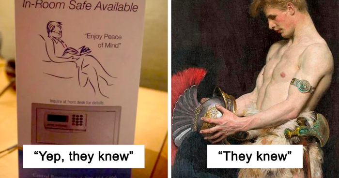
Online communities have turned these visual double meanings into their own comedy genre. The joke usually works because the object is technically innocent, yet its shape, wording, placement, or surrounding context suggests something entirely different. Collections built around the “they knew what they were doing” idea frequently combine strange food, unfortunate typography, suggestive product design, and wonderfully questionable marketing decisions.
Why Innocent Things Can Look So Suspicious
A double entendre is an expression with two possible interpretations, usually with one meaning that is more risqué than the other. Visual comedy can accomplish the same trick without saying anything. Two harmless shapes overlap, a photograph lines up with nearby text, or an innocent object is viewed from one catastrophically perfect angle.
Our brains are extremely enthusiastic pattern hunters. Pareidoliathe tendency to perceive recognizable forms in ambiguous stimuliis a normal and common experience. It is why people see faces in clouds, expressions in kitchen appliances, and oddly specific anatomy in vegetables.
Researchers have also found that people may process face-like objects using mechanisms similar to those used for real faces. We do not merely notice two dots and a line; we may instantly assign the “face” an emotion, attitude, or personality. That explains why a mailbox can look judgmental and a bell pepper can appear deeply offended by dinner preparations.
Design principles add another ingredient. Similar shapes and nearby elements are naturally interpreted as related, even when no relationship was intended. A designer may see three separate components, while the public sees one unforgettable and highly questionable picture.
50 Innocent Things That Look Suspiciously Intentional
Signs, Slogans, and Typography Trouble
- The unfortunately divided store name: A harmless business name is split across two lines, creating a new phrase the owner definitely did not include in the original plan.
- The missing letter: One burned-out bulb transforms a respectable hotel sign into an invitation that sounds considerably less respectable.
- The enthusiastic restroom arrow: A directional arrow points toward a person in an advertisement, producing instructions no public facility should ever display.
- The slogan beside the wrong doorway: “Come on in” seems friendly until it is printed next to a photograph that gives the phrase an entirely different energy.
- The badly cropped banner: Half a word disappears behind a pole, leaving behind a shorter message that attracts more attention than the complete advertisement ever could.
- The vertical word stack: Individually harmless words become a scandalous sentence when read downward instead of from left to right.
- The accidental acronym: A committee selects a serious three-word name without checking what its initials spell in giant letters.
- The price sticker placement: A discount label covers one crucial syllable, turning a family product into something requiring an age-verification screen.
- The handwritten spacing disaster: A missing gap between two words converts a wholesome bake-sale sign into a neighborhood controversy.
- The motivational quote gone rogue: An inspirational phrase appears next to an oddly positioned body-part diagram, making personal growth sound alarmingly literal.
Packaging That Deserved a Second Review
- The transparent package window: A window intended to showcase the product reveals two rounded items beside a longer one. The snack aisle is never the same again.
- The mascot’s misplaced hand: A cheerful cartoon character reaches toward the logo, but the package seam makes the gesture look wildly inappropriate.
- The smiling fruit arrangement: Three pieces of fruit create a faceor anatomydepending on whether the viewer is eight years old or has internet access.
- The zipper bag illusion: A package crease lands precisely between two printed shapes, creating a design feature nobody approved but everybody notices.
- The bottle-cap silhouette: Two bottles stand side by side, and their caps, curves, and shadows combine into a suspiciously familiar outline.
- The “extra large” label: A size claim appears directly under an image that makes the label feel less like product information and more like bragging.
- The unfortunate flavor name: A perfectly legitimate ingredient becomes comedy when paired with words such as “thick,” “creamy,” “stuffed,” or “bursting.”
- The nutrition badge placement: A round badge covers part of the model’s clothing, creating an accidental censorship sticker where none was needed.
- The folded candy wrapper: The unopened wrapper is innocent. Fold it once, however, and the brand name suddenly requires an apology.
- The child-friendly character with adult eyebrows: A mascot’s raised eyebrows transform an ordinary smile into the expression of someone who knows exactly what the package resembles.
Food With an Unexpected Sense of Humor
- The ambitious carrot: Nature grows a carrot with two legs and several unnecessary details, immediately making it too famous to become soup.
- The suggestive mushroom: A mushroom develops a shape so anatomically specific that photographing it becomes more urgent than cooking it.
- The peach pair: Two peaches rest together in a produce display, proving that fruit can create comedy without saying a word.
- The hot dog presentation: The cook adds two round garnishes in exactly the wrong place and then claims surprise when everyone starts laughing.
- The bread roll with cheeks: Dough expands along one central seam, producing a loaf that appears ready to sit down.
- The innocent popsicle: A melting frozen treat loses its original shape and gains a second meaning before anyone reaches the napkins.
- The eggplant photo shoot: The vegetable is displayed beside a peach, suggesting the produce manager has spent at least five minutes on social media.
- The frosting nozzle accident: A baker decorates cupcakes using tall swirls and suddenly realizes why the customers are taking photographs.
- The sausage arrangement: Several sausages are stacked around two dinner rolls, and the plate becomes the evening’s most discussed guest.
- The latte-art surprise: A barista attempts a heart, but the milk foam chooses a design that cannot be shared in the company group chat.
Architecture and Public Design Fails
- The building with an expression: Two windows and a doorway create a face that looks shocked by its own property taxes.
- The suspicious fountain: Water shoots from a statue at a height and angle that make every tourist photograph look deliberately edited.
- The playground equipment: A slide, tunnel, or climbing frame is technically safe but possesses a silhouette that leaves parents avoiding eye contact.
- The hotel room number: A memorable number is installed beside a decorative shape that upgrades a childish joke into a complete visual production.
- The oddly shaped bollards: A row of protective posts looks normal from the front and absolutely not normal when viewed from the sidewalk.
- The dramatic handrail: A curved rail meets a round wall fixture, creating public art nobody requested.
- The restroom floor plan: Two circular rooms connect to a narrow corridor, and the architect’s blueprint becomes more entertaining than the finished building.
- The misplaced shrubbery: Landscapers plant two round bushes beneath a narrow tree trunk, then apparently leave before examining the view from the parking lot.
- The church sign and steeple: The sign’s slogan aligns with the building’s architecture in a way that inspires thoughts not covered during Sunday service.
- The bench with a surprise: A decorative post rises through the center of a seat, ensuring nobody sits comfortablyor photographs it innocently.
Advertisements and Photos With Perfectly Bad Timing
- The bus-door transformation: An advertisement is attractive while the doors are closed. When they open, the model’s face stretches into experimental theater.
- The magazine-cover collision: A celebrity’s head overlaps with the title, creating horns, strange hair, or a new sentence that sounds like gossip.
- The sports photo angle: One athlete blocks another at the precise moment required to create an anatomically impossible person.
- The photobombing statue: A statue’s raised hand appears behind a tourist, producing a gesture the tourist did not make but will spend years explaining.
- The billboard and streetlight: A pole aligns with the model’s body so perfectly that commuters suspect the installer deserved a bonus.
- The product beside the headline: A newspaper places an advertisement next to an unrelated story, accidentally creating the darkest marketing campaign of the week.
- The pet’s inconvenient position: A cat sits behind its owner, and its tail appears to emerge from a place where humans traditionally do not grow tails.
- The reflection in the glass: A store display reflects a nearby mannequin or passerby, adding a mysterious body part to the photographed subject.
- The wedding-photo illusion: A guest’s arm, the bride’s dress, and the groom’s stance combine into a scene that sends the photographer straight to the editing software.
- The shadow that ruins everything: The object itself is harmless, but sunlight casts a silhouette so suggestive that even the designer would struggle to defend it.
Did They Really Know What They Were Doing?
Sometimes, unquestionably. Clever designers intentionally use negative space, visual double meanings, and hidden symbols to make logos more memorable. A successful dual-purpose design rewards the viewer with a small “aha” moment.
Other times, the joke emerges only after manufacturing, installation, photography, or ordinary use. The person who designed a label may never have seen it wrapped around the final container. The architect may have examined the front elevation but not the building’s reflection in a neighboring window. The restaurant manager may have arranged the food while hungry, tired, and innocent of all internet humor.
Context also changes perception. A phrase that sounds harmless in a meeting can become hilarious when printed beneath a particular photograph. Accidental double meanings have long appeared in headlines because readers may group words differently from the way the writer intended.
This is why reviewing a design only in isolation is risky. Effective user research and testing expose interpretations that the original team may never anticipate. Showing a package, sign, interface, or advertisement to fresh viewers can reveal unintended messages before thousands of strangers reveal them much less gently.
Relatable Experiences: Once You Notice It, You Cannot Unsee It
The First Double Take
The experience usually begins with confusion rather than laughter. You are walking through a grocery store, waiting for an elevator, or scrolling through photographs when something briefly feels wrong. Your eyes move backward. You examine the object again. The innocent explanation remains obvious, but a second interpretation has already entered your mind and unpacked its luggage.
There is often a wonderful half-second in which you wonder whether anyone else sees it. You glance at the person beside you. They glance back. Nobody speaks because speaking would officially confirm that two adults are giggling at a bottle of salad dressing. Then one eyebrow rises, the social contract collapses, and both people lose their composure.
The Need to Share the Evidence
The next stage is documentation. A phone appears almost automatically. The photograph must be taken from the correct angle, because moving three inches to the left may restore the object’s dignity. The comedy depends on alignment: the pole behind the advertisement, the shadow across the sign, or the fold in the packaging.
Sharing the picture introduces a new challenge. Should you provide an explanation or let the recipient discover the joke independently? Explaining too much can weaken it. Saying nothing, however, risks receiving the dreaded reply, “What am I looking at?” The ideal caption is usually something restrained, such as “Interesting design choice,” or the classic accusation, “They knew.”
How Different People React
Not everyone notices the same details. One person sees a badly installed handrail. Another sees a masterpiece of accidental adult comedy. Someone with design experience may focus on spacing, contrast, and composition, while a child may identify the second meaning instantly and announce it at a volume previously thought impossible indoors.
These differences make the images especially shareable. Viewers enjoy testing whether friends will interpret the picture in the same way. The photograph becomes a tiny visual puzzle, except the reward for solving it is usually the realization that everyone involved is less mature than they claimed.
The Designer’s Imaginary Defense
Another part of the fun is imagining the chain of approval. Someone created the concept. Someone reviewed it. Someone selected the materials. Someone installed it, photographed it, stocked it, or approved the final print. Did every person miss the second meaning? Did one employee notice but decide that mentioning it would make the meeting uncomfortable? Did the entire team recognize the joke and quietly send the design into production?
The truth is often impossible to know, which is precisely why the phrase “they knew what they were doing” works so well. It is not a proven accusation. It is a playful acknowledgment that the coincidence has become too perfect to ignore.
When the Mistake Becomes Better Than the Design
Ironically, an accidental visual joke may attract far more attention than the original design. A routine sign becomes a local landmark. An oddly shaped vegetable earns millions of views instead of becoming dinner. A packaging mistake gives an unknown brand free publicity that a formal advertising campaign could never purchase.
That does not mean companies should deliberately make every package resemble something inappropriate. The strategy is difficult to control, unsuitable for many audiences, and capable of turning mildly amusing attention into a reputation problem. Still, accidental humor reminds designers of a useful rule: audiences do not experience individual elements separately. They see the complete arrangement, including every fold, shadow, crop, reflection, and nearby object.
For everyone else, these moments provide a harmless break from ordinary life. The world briefly appears to be winking at us through a loaf of bread, a hotel sign, or a badly positioned streetlamp. Whether anyone truly planned the joke hardly matters. We noticed it, we laughed, and we immediately photographed it before somebody fixed it.
Conclusion
Innocent things become suspicious when shapes, words, timing, and context collide with almost supernatural precision. Sometimes the result is clever design. Sometimes it is pareidolia. Sometimes it is a tired employee placing a sticker in the worst possible location. Whatever the cause, these visual double meanings succeed because they let the viewer participate in the joke.
The next time a package, building, food display, or advertisement makes you stop and stare, remember that your brain is doing what it does best: finding patterns and attaching meaning to them. Whether the creator planned that meaning is another question entirelyand one the internet will debate with enormous enthusiasm.

